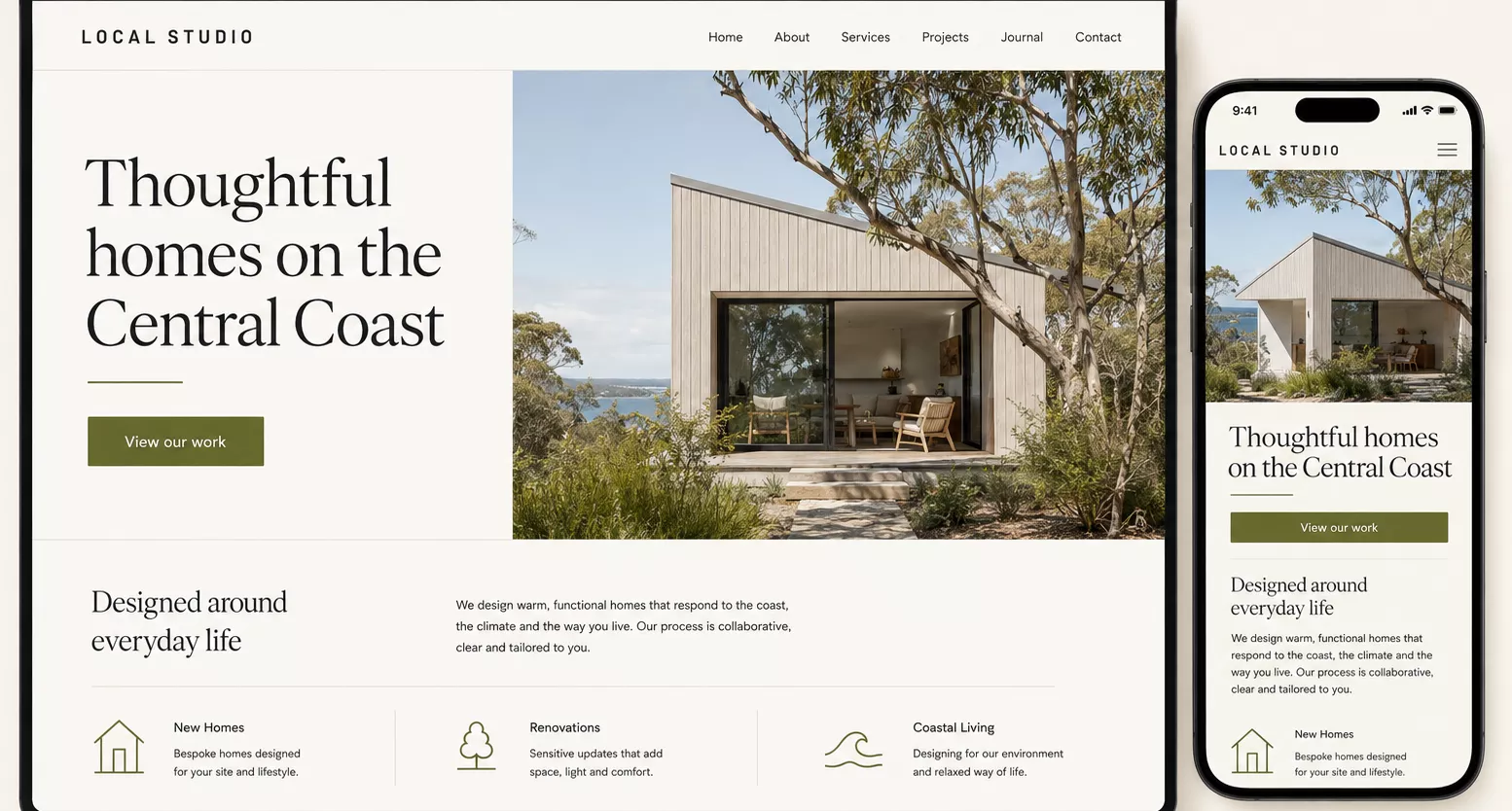
A website’s layout affects how much people read and which information they notice. Photography helps them assess the business. The wording explains whether it offers what they need. These decisions belong in the same conversation. If the design is approved before anyone considers the content, useful information can end up squeezed into whatever space is left. For a Central Coast business, there’s another consideration. The website should give people a clear understanding of where you work and who you work with. That takes more thought than adding a suburb list to the footer.
Work out what the page needs to explain first
Before choosing a layout, write down the questions a potential customer needs answered. For a service business, that might include what the service covers, where it’s available, how pricing works and what happens after an enquiry. Some questions need a sentence. Others deserve a separate page. That gives the design something useful to organise. A fixed layout with three small text boxes can become a problem when the business has four distinct services, each needing a different explanation. Cutting the copy to make the boxes match might improve the screenshot while making the website less helpful. Designing around the actual information avoids that compromise. You can still have generous spacing and a strong visual identity. You just know what needs to fit before deciding how it should look.
A clean layout can still contain useful detail
A page can feel crowded with very little text. It can also contain substantial information and remain easy to scan. The difference is often in the organisation. Long paragraphs under vague headings take effort to navigate. Shorter sections with descriptive headings let readers find the part that matters to them. Details about pricing or service areas are easier to locate when they have an obvious place on the page. There’s no SEO word count to aim for. Google’s SEO Starter Guide explicitly says content length alone doesn’t determine rankings. A useful editing question is whether a paragraph helps someone make a decision. Explaining what a quote includes does. Repeating that the business offers exceptional service probably adds very little.
Choose photographs that explain something
An original photograph can do several jobs at once. A photo of a business entrance helps customers recognise the premises. A project image shows the type of work a contractor takes on. A team photo introduces the people a customer might meet. That makes photography part of the content planning. For a Central Coast business, local images are most useful when they have a real connection to the work. A completed renovation in Woy Woy, published with the client’s permission, gives a builder something specific to discuss. A short caption can explain the scope of the job and the materials used. A beach photograph might suit the brand, but it tells visitors less about the service itself. Give the most prominent image space to photographs that help explain the business. Image preparation matters too. Large files can slow a page down, and a wide desktop photograph may crop awkwardly on a phone. Google recommends optimising images for quality and speed, alongside providing appropriate text descriptions.
Make the local details useful
A business can represent the Central Coast through the information it provides. For a business with premises, that could mean clear directions and an explanation of where customers can park. For a mobile service, it could mean an accurate service area and any travel charges that apply. These details answer practical questions. If you regularly work in Erina and Gosford, explain what you offer there. Where you have suitable project examples, connect those locations to the work. Avoid suggesting you have an office in a suburb if you only travel there. Local character can also come through in the design. Your own photography and the way you describe the business can give the website a recognisable identity without relying on coastal colours. The appropriate visual style depends on the business. A professional consultancy and a surf retailer can both belong on the Coast while looking completely different.
Give each service enough room
A homepage needs to introduce the business and help visitors find the next relevant page. It doesn’t need to explain every service in full. If two services involve different customer questions, separate pages may make the information easier to navigate. Each can explain its scope and give relevant examples, with a clear way to enquire. Use descriptive links between those pages. Someone should be able to tell where a link leads before clicking it. Google also uses links to discover pages and understand their context, as its link guidance explains. The same principle applies to article content. A helpful article can answer a narrower question, then point readers towards the relevant service when they want help. We’ve covered the distinction between a website’s initial SEO setup and ongoing work in Do I Need SEO When I Get a New Website?
Review the mobile layout with the real content
A desktop design doesn’t show how the same page behaves on a phone. A short heading can become several lines. Text over a photograph may lose contrast when the image crops. A row of project images can turn into a long scroll before the visitor reaches the service information. Check the page with the final wording and photographs in place. Temporary content can hide these problems. Try completing a specific task on your phone. Find a service, check whether it’s available in your area, then send an enquiry. Notice where you have to search or scroll back. Those observations give you concrete changes to make. Perhaps the contact link needs to be easier to find, or the opening image takes up too much space. The answer depends on what the page is asking people to do.
Show the thinking behind the finished work
Project examples become more useful when they explain a decision. Alongside a screenshot, describe what the business needed and how that affected the website. Perhaps customers needed a clearer way to compare services. Perhaps the existing photographs didn’t show the work properly. A brief explanation gives prospective clients more to assess than appearance alone. Keep results specific. If you’ve measured an increase in enquiries, provide the timeframe and context. If you haven’t, explain the changes you made without attaching an unsupported performance claim. At Willow Jam Media, we build websites for businesses on the Central Coast and across Australia. Learn about our web design services on the Central Coast and explore selected projects on our homepage. If you’re planning a new website, bring your existing content and any photographs you have. They’re a useful starting point for deciding what the design needs to do.